Monday, April 18, 2011

Final/Communication Banquet

For the final project I have planned out to design an two fold banquet programs 8.25X5.25:  full bleed 0.125, 4 color, with 0.25 margin for this design. 

Call to Action:  Program itself, it gives an outline of the night, it answers what when where & how!

Targeted audience:  Communication Graduates, Faculty, and guests! 

Budget for this project: 500 programs two fold 4 color at Quick Print cost $285.00


Rough Drafts


Fianl Product


This project was personally fun for me because it took every concept what we learned in class to reality.  I worked with 6 team members, that had the final say about the design.  In all the previous projects we just designed something of our taste then we had ideas from Mrs. Benson or peers to make changes on our days we had online screen critiques.  I actually got to experience factors of dealing with Quick print (weight of the paper when print and then getting the programs scored), team members:  approving style of the graphics, fold, colors, word usage.  Honestly after bringing this to a final product, I was more proud of this design, for the reason it brought in live experience with what I want to do with my career.  
Mrs Benson I want to thank you personally for this!

Images Copyright by Istock by permission of Instructor

Wednesday, April 13, 2011

Magazine Ad

Target Audience:  Young Women 18-30/ How to deal with Stress!!!

Call to action:  Microsoft tag Specs 4/C Raster  Cosmopolitan Magazine:  8 1/4 x 11 1/8, .125" bleed .25" margin CMYK

10 Thumbnails

Rough Draft
Magazine Specs
Final design for this project, all images from Istock & Microsoft by permission of my instructor. This piece was amazing to have fun with.  The thought process of stress is something everyone can relate to.  I learned researching for this project of cost it would take to place an ad such as this, for example $125,000.00 for an inside cover. 

Monday, April 4, 2011

Logos

For this assignment we are to find a logo that has changed & discuss its changes, while providing our own opinions of the new/old design.


Old

New

Old Logo:  colors are warm, but boring, design is well centered & aligned, doesnt catch my eye, although i think they were reaching for an authentic look

New Logo:  bright colors to catch costumers,  graphically pleasing with the slanted bell, bold font brings in more attention

Newspaper Ad Specs

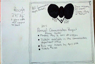
Our project was to develop an ad to run in the Collegio with a $96 budget, no bleed, 0.25 inch margins, 4 column width 6", Indesign file 7.71"x6".  Call to action:  bring in communication majors to the banquet  Targeted audience:  All Communication majors & Faculty

 Thumbnails


Bitmap Image/Final Image
Copyright@Jodi Heflin


Final Product of Newspaper Ad


Wednesday, March 30, 2011

Good or Bad Design Ads

For this assignment we were to research ads that caught our eye, and discuss how we felt about that ad.  Below are ads from magazines and packages that I found either horrible or perfect for the targeted audience. 
 Copyright/redcloudphoto.wordpress.com
This front cover is simple, has a breathe taking image that is clean, with reverse bold font, and brings to the readers eye.  As a photographer wanting to know more about black & white photography this would definitely catch my attention.  

 Copyright/http://idsgn.org/category/design/
Box Bottle Bag shows visually die cutting for the essential product, embedded with various colors to make this design standout.  Love this particular work for it's variations of style.

 Copyright/http://www.fashionisingpictures.net/photoshoots/FashionMagazineApril2010Covers8.jpg
For this front cover I do not like the differences in font and the bold pink GLAMOUR accrossed the models face.
Copyright/http://4.bp.blogspot.com/_ityhrXCvzxA/SZvKCjUoVZI/AAAAAAAAABE/mwzgo3LBnBM/s320/Picture+18.png

OH boy what is this was my first reaction to this product!!! Well well this is chocolate candy pieces!! The name just makes you wanna bite right into this candy doesn't it!!! I really not need to say more!!! Not a fan of the name, or the design of the packaging, PIG nose come on!!!

Monday, March 7, 2011

Direct Mail


 10 Templates
 Final  Rough
For the direct mail project  I chose to do a 7 by 5 inch layout.  What better way to use this opportunity to do it over my photography.  The objectives for this project are to keep the same layout, and have 3 different things that change example( photos, name, text) also the address.  Targeted audience graduates looking for professional portraits or even males or females for business criteria.


Final Product

Tuesday, February 22, 2011

Notepad/Thumbnails/Roughdraft

Thumbnails

Rough Draft
Final Product
For class we were to design 10 thumbnails and one rough draft of a notepad that describes us as an individual.  I am a photographer/graphic designer, and targeted audience: new clients.
All work created and designed by Jodi Heflin copyrighted 2011


Digital File Preparation/Photoshop Files

 COB created by using my own image, Photoshop clipping path, saved file as eps 300 resolution.  This image was traced with a pen tool in photoshop then placed in an Indesign file.

 Duotone Raster with a full bleed, saved as an eps file, color mode: Duotone Pantone 120 C chosen from the Pantone Process book.  300 Resolution image

 Grayscale Raster full bleed saved as flattened eps or tif color mode grayscale
300 Resolution with an 1/8 inch bleed should built into Photoshop file to fit a 6 x 4.25 in post card.
Proof of an image taken from my photography files of my roommates dog Dakota
Four Color Raster full bleed saved as flattened eps or tif color mode: CMYK 300 Resolution